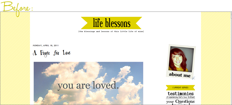
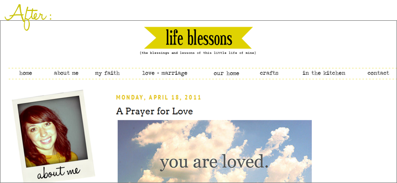
Over the weekend, I decided it was time to give the blog another little makeover, though I feel like it’s more of a “refining” than a complete “revamping.”
I was pretty happy with the overall design scheme, but there were a few quirks that bothered me about the old design. Namely, the fact that there was a lot of wasted space on the sides of the page. If you have a small screen, that works great. But if you have a wide-screen computer like I do, then everything feels crammed.
I also wanted to add a menu bar below my header and clean things up a little.
I finally got around to all that this weekend, and must say that I am quite content with the aftermath.


I also made the blog mobile-friendly, which means that any of you who visit via smartphone, iPad or iPod will now see a much more streamlined layout that I think will make reading on-the-go much easier! (In case you're interested in adding this to your own blog, it's pretty easy to do if you set up a Mobify account. It took me about 5 minutes to do!)
And, because I know that many of you will be curious about the specifics that went into it, here are some details…
- First of all, I switched from the old Simple layout I had been using to another of the standard Blogger templates, “Minima Lefty Stretch.” It is not available in the new “Template Designer,” but you can access it by clicking on the “Design” tab in your Blogger account and selecting “Edit HTML.” Scroll to the bottom of that page and you can “Select Layout Templates,” listed under Old Templates.
- Once you select this template, you can still go into the “Template Designer” and some of the tweaking options will be available (such as changing the font size and color) that makes personalizing the layout much easier.
- I like this new template because it fills the entire page and will flex depending on what size screen you have. (Play around with the size of the window and you'll see what I mean!)
- Since the new layout is "stretchy," I decided to make the static images (those that aren't inside individual blog posts, like the polaroid photo in the sidebar and the menu images below the header) stretchy as well. It's a surprisingly easy little hack to make, by simply including a bit of extra code into the image tag. Just go into the image tag < img > and add width=100% (html code shown in italics). Making the width a percentage means that no matter how big the sidebar is, the image will always fit. That's just an example, though; the percentage can be whatever you want.
- I added a menu bar under the header by creating a new HTML widget and then uploading various images and linking them to different pages on my blog. (I explained some of this in more detail in a previous post about blog design tips.)
- To create the buttons for the menu choices (“home,” “about me,” etc.), I downloaded the font Traveling Typewriter.
- Finally, I decided—at least for now—to do away with some of the more image-heavy content that I had previously, specifically with the sidebar and the special title fonts. I loved being able to have everything show up in pretty fonts, but it took a lot of time to create and then if I wanted to update anything, it ended up being something of a chore. So I’m letting the template do its work, by using the built-in fonts and more straight-forward links (like you can see in the “Browse by Category” widget in the sidebar of the new design).
The Fonts I Use On My Blog
Advice for Starting a Blog


Check you out! I'm HTML stupd... so I just C&P my blog designs... someday I'd like to learn more but until then I'll just be impressed with others!
ReplyDeleteHaha, thanks for the kind words, PJ! I took one single HTML class back in high school and surprisingly it has really paid off!
ReplyDeleteVery nice! An updated look is always fun! :)
ReplyDeletelove the new look! and thanks for the tips, I need to start learning more of this!
ReplyDeleteLooks great, Carmen!!!
ReplyDeleteLove it! Great job!
ReplyDeleteThanks so much, friends! I appreciate the kind words! :)
ReplyDeleteHi! Just came across your blog, and I'm loving the design tips. Having ZERO experience with HTML or design, it's super super helpful for me...so thanks!!
ReplyDeleteDo these tips still work with the new Blogger interface?
ReplyDeleteI think they should, but I use the standard interface and an older template, so I can't say for sure 100%. Just make sure that if you make any changes to your template, you back-up the original in case something goes wrong!
ReplyDelete