
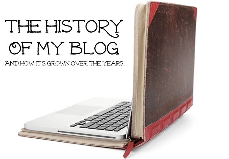
In walking through the history of creating and growing my blog, I've looked at the steps I took when I first started it as well as how I went about growing a readership. (Click here to read Part 1 and Part 2 if you missed them.) Today I'll be talking about how I've tweaked the design of my blog and established some branding over time...
By nature, I’m a perfectionist, so I’m always on the lookout for things I can do to improve my blog, even when they’re the smallest of changes, and that facet has been nowhere as evident as in my blog’s design, which has evolved little by little—quite literally—over the past two years.
I’ve redesigned my blog a handful of times, sometimes even right after a previous design. I’ve tried out new templates, new HTML coding, new widgets. I’ve tried completely new designs and then subtle tweaks that a visitor may not even realize has been changed. (You can see some previous designs of this blog here and here.)
The thing is that each change makes the blog a little bit better, a little bit closer to the vision I have in my head, and over time those changes are cumulative to what you see here, today. I’m always on the lookout for these kinds of incremental improvements, and I think that has really streamlined my blog over the years. I’m always willing to try something new and see if it works.
I think that’s one of the elements that has been key to my blog: Always looking for ways to improve my blog, even in the smallest of ways.
(Given that I do a lot of redesigning on the fly, I make sure to save copies of all my old HTML coding, in case something ever happens to my site or if I ever want to revert. I haven’t really needed that, but I tend to err on the side of caution. Learn how to back-up your HTML here.)
I know that HTML coding can be intimidating and while I do have a good working understanding of it—courtesy of an elective class I took in high school—I still don't have a clue what I'm doing most of the time. Instead, I usually spend an absurd amount of time doing online searches for tutorials to walk me through how to hack any given solution. (You can see some of my favorite online tutorials here.)
There's nothing wrong with hiring a company to design your blog for you, and I think that can be a worthwhile investment. But, since I have always approached my blog as a hobby as opposed to a business, I've never wanted to sink much money into it, especially if with enough gumption I can DIY it on my own.
Plus, by doing it on my own, I'm able to tackle issues as I come across them, one at a time, which makes it a lot easier to accomplish.
And I think that’s one of the things that people can neglect when it comes to a blog. The fact is that there are millions of blogs out there, so it’s helpful if you can give readers something memorable to hold on to, so that they can distinguish your blog from all the others out there. For me, I’ve latched on to that simple yellow banner, and extended that color scheme into the simplified color palette that’s used in the links, subtitles and accent colors throughout the blog.
A blog’s brand doesn’t have to be complicated, but it does have to be intentional, thoughtful. I’ve looked for simple ways of infusing that brand into every element of the blog, whether it’s my Facebook page, favicon or font choice.
For example, I recently played around and made an effort to simplify the fonts on my blog, swapping out the font that was in the yellow title banner to something more clean. I then selected a similar font for the subtitle and used that for the headers in the blog’s sidebar. In doing so, I try to keep a limited number of fonts in use throughout the main blog design so that the design feels more seamless; although I do take much more luxury playing around with fonts in the image headers I use for each post.
Things like that may not be noticed by many people (although one kind reader did email me to let me know she noticed!) but I trust that they slowly add up and make a difference in the end!
Next week, I’ll wrap up my story and share about how the content on my blog has evolved over time.
Related Posts
5 Recommended Resources for Revamping Your Blog Design
Answering Your Questions: Blog Design
{ photo source }


No comments:
Post a Comment
Note: Only a member of this blog may post a comment.